In today's digitally fast-paced era, a website has become the successful defining asset for businesses. A website forms a digital presence for your brick-and-mortar stores. It showcases the goals and the offerings of any specific brand.
A website paints the company's picture in the customer's mind. It enables them to decide whether they want to learn more about the business or not.
A website guides the user throughout their presence, allows them to learn more about the products and service, and gets their queries answered from 24/7 present customer support service. Hence, ensures a seamless user experience.
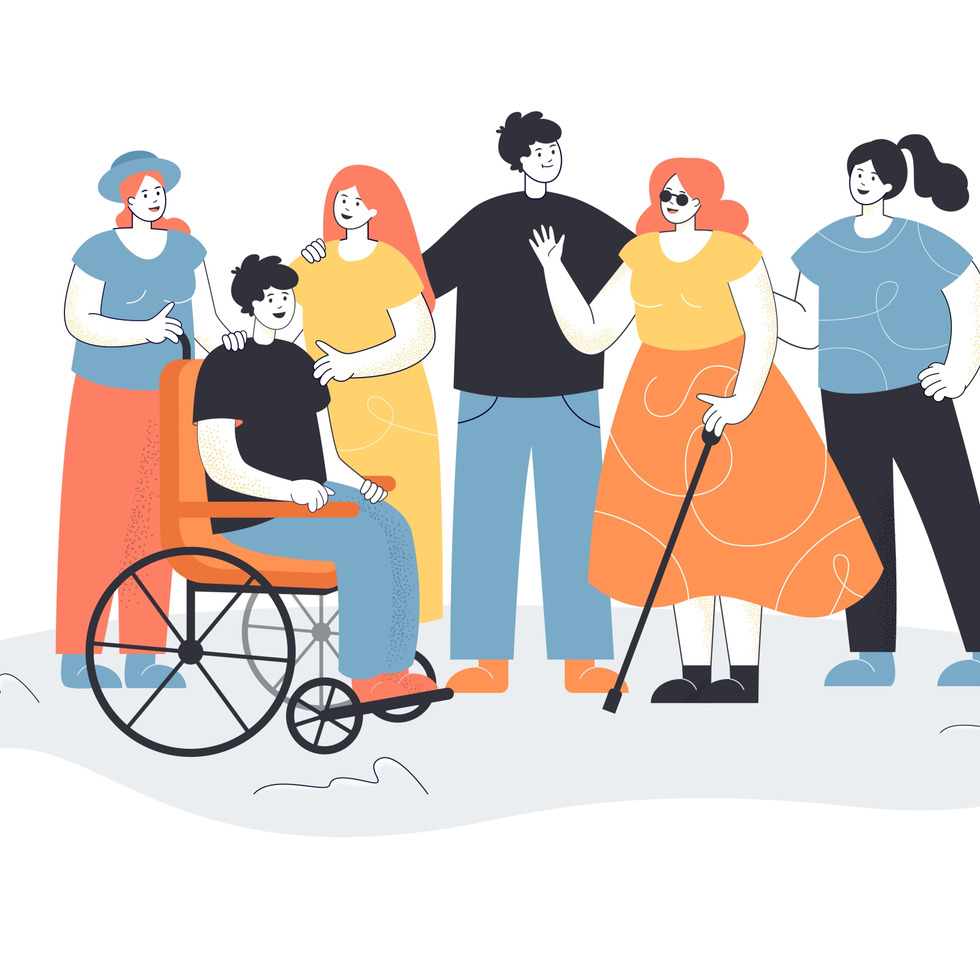
Therefore, a website should meet all the accessibility standards and should not limit the usage for any person- abled, disabled or differently-abled.
If you are on your way to launching your online business or already have a website that is not ranking high on the search engines, you may want to take a step back, learn more, and consider improving your website accessibility.
If you want to leverage and capitalize on the benefits of a well-designed and accessible website, this article is for you.
Table of Contents
What Is Website Accessibility?
Almost everyone is well aware of what a website is and how it works; most people have little or no idea about website accessibility. And this is the biggest reason why even investing tens of dollars on web development and their website is not generating the desired results.
So, first things first, let us learn the basics about web accessibility requirements, accessibility guidelines, and accessibility barriers.
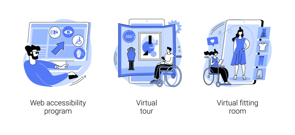
Web accessibility defines the SEO tools and assistive technologies developed to enable the user to perceive, understand, contribute, navigate and interact with the accessible content on the site. Even though it is targeted more at disabled users, it also benefits people without any disabilities.
The main purpose is to allow easy, hassle-free, and user-friendly access to the web. Accessible sites include a web design and accessibility framework based on various sensory channels using multimedia content such as audio and video. Instead of the mainstream point-and-click user interface, web accessibility incorporates site navigation and interaction based on keyboard-user control and voice-based navigation.
It is essential to keep the factor of accessibility in mind while developing and designing the website, as you cannot retrofit the accessibility tools in the website afterward.
Web accessibility guidelines include all kinds of people with disabilities such as:
- Visual impairment (including color blindness)
- Auditory impairment
- Cognitive impairment
- Intellectual disabilities
- Neurological disabilities
- Motor disabilities
- Physical disabilities
- Speech delay and impairment
So, to allow every disabled user to freely become a part of your brand and enjoy the same digital privileges' as people without disabilities, it is important to resolve the potential issues that compromise the accessibility features.
Here is how people without any disability can leverage the various aspects of accessibility, such as:
- Using webs from mobile devices, and other smart devices such as smart TVs and smartwatches
- Older people who experience changing or deteriorating abilities due to aging
- People with short term or no permanent disability such as a fractured arm or compromised eyesight
- People who want to access the website in bright and bright daylight or are stuck in a place where they cannot listen to the audio content
- People experiencing limited slow or disrupted internet connection
According to the WHO- World Health Organization, 1 Billion people amongst the entire world population live with a disability.
So, if you have do not curate a website that allows a seamless buyer journey to all the users with disabilities, you would probably lose a big chunk of the audience- not to mention your reputation and money.
Importance of Website Accessibility

Websites are not only limited to businesses or brand promotion. From education to healthcare, commerce, and more, every web niche must provide the same user experience to everyone, regardless of their background, race, religion, or disabilities.
As per the criteria set by UN CRPD-United Nations for Convention on the Rights of Persons with Disabilities, equal access to communication technology, information, and websites are acclaimed to be the fundamental human rights.
In the past, when web technologies and diverse, accessible forms were only a part of the thought process, it was hard to make disabled users feel inclusive. However, now the ability to print use accessible content via audio, video, and images, it is possible to overcome the web accessibility barriers.
Improving your website accessibility with dynamic content marketing can attain strategic innovation, enhance brand outreach and help you reach a bigger market and audience.
Best Ways to Enhance Website Accessibility
To work around accessibility barriers, many web developers and designers leverage assistive technologies to enable people with disabilities to browse the internet. For example, assistive technology users often seek help from screen readers to vocalize the written content on a site, Braille terminals or special keyboards to type, or speech recognition software to convert their speech into written content.
By incorporating such tech-savvy methods, every website owner can enhance user experience and navigate a bigger target audience to their business.
However, it is easier said than done. There are many technicalities and accessibility regulations behind a successfully accessible webpage. In addition, every company's marketing and content management system needs to align its web design with the customer needs.
Therefore, it is crucial to incorporate a strategic approach alongside content optimization using SEO (Search Engine Optimization) to execute your accessibility plan successfully.
To help you craft a practically possible and accessible design, here are some innovative ways to enhance your web accessibility.
Create Easily Accessible Content
When creating a website it is best to use content management systems (CMS) such as WordPress or other tools. The content should be easy-to-read and accessible to the users.
Usually, the content on any website can be easily accessed, and problems arise when the host of the webpage is "dynamic content." Dynamic content updates or changes without the page being refreshed/reloaded, and the user might not be aware, especially if they are screen reader users.
Such content includes popups, in-page updates, screen overlays, modal dialogs, and more. If the disabled user is only using a keyboard, they may get stuck within page overlays.
Nevertheless, dynamic content can be easily tackled and made accessible by using ARIA (Accessible Rich Internet Applications) roles and landmarks, alongside front-end development frameworks to support and enhance web accessibility.
ARIA is a powerful yet complicated technical tool that adds and turns accessibility information into not-so-native accessible elements. The best way to do this is to use HTML elements whenever possible. Most of the HTML functions replicate the role of AIRA, including:
- HTML button tag can be used instead of the ARIA role of button.
- HTML label tag in place of ARIA-label
- HTML 5 navigation tag in place of ARIA role of navigation
AIRA also enables the users with straightforward navigation instead of clicking on the irrelevant list of links.
With the recent assistive web technologies, most of the AIRA attributes can be incorporated into the HTML. However, an important thing to note here is that AIRA is only one of the web-accessible tools. It holds no benefits for keyboard-only users. It would help if you integrated other interactions, tools, and behaviors using different software such as JavaScript.
Video content should also be carefully put up on the sites. No video should be on the "auto-play" mode and every video must have options to offer transcription and captioning for users with hearing impairments.
Similarly, if you are using any technical or unique widget (slideshows, GIFs, etc..) to add written or graphic content in any form, ensure that it conforms to the accessibility practices and tests.
Design your Forms for Website Accessibility
Forms are a creative and useful addition websites and also improve their accessibility. However, they should be designed very carefully.
The forms must be clearly labeled with each field specified. Place labels next to the relative fields for the users to understand
Include error counts in the title of the page so that the user who has submitted the form can conform to form submission and cater to submission errors if needed. The form should also contain easy-to-understand instructions and information for the users.
Create a Keyboard-Friendly Web Design
People have a different range of disabilities. For example, some people have mobility impairments, such as repetitive stress injuries that limit or prohibit using a mouse or a trackpad. Such people fall in the category of "keyboard-only users."
So, for your website to be accessible, users must navigate all web pages, content, links, and more without a mouse. The easiest way to browse any website using only the keyboard is to use the "Tab" key. It allows the disabled users to skip irrelevant content parts and access the "keyboard focused" areas.
Therefore, to ensure accessibility to the website, it is crucial that the entire content can be accessed and navigated by the "TAB" or "arrow" key. Moreover, an option for "skip to main content" must also be included at the top of every page. So, keyboard-only users can get straightforward access to the main and relevant content.
Leverage ALT Text for Images
"Alt text" adds descriptive summaries for each image to allow the screen readers to read and decipher the content. This particular accessibility feature is crucial for informative images, including infographics.
Include the text in the "alt" that you want to convey via the images. If the image you are using already has text, that should also be included in the alt text.
However, if the image goes up on the website only for aesthetic purposes- to decorate the page and make it look attractive and presentable, you can leave the alt text empty. It will also help the screen reader focus on the main website content instead of hovering over the irrelevant stuff.
Ensure that you provide alt text for every image used as a link, or else the screen reader will only read the file name and not the content.
So, it is essential to add proper alt text to all the images on your website to improve accessibility.
Choose the Colors Carefully
you have to be very smart when choosing the colors for your website. While some individuals cannot see the colors or differentiate them, others use them to perceive and organize the content.
Color deficiency or color blindness is one of the most common forms of visual impairments, with 8 percent of the total pollution suffering from red-green color blindness or deficiency.
If your websites majorly included the red-green color scheme, the deficient individuals will never understand or perceive the content.
On the other hand, people with learning disabilities benefit from the colors to understand and distinguish the website content.
To cater to both groups and equal opportunities to surf the website, use accessibility test tool kits to evaluate the color contrasts. Moreover, you can add visual indicators (asterisk, question marks, hyphens) to help the users distinguish the content.
Ideally, it would be helpful to choose a dark color against light color (usually for the background). However, the colors should not bleed or blend in with each other. Instead, the color contrast is clear and appears distinguishable to users with low vision or color blindness.
Include proper Headers
For web accessibility, it is essential to structure the content properly and create a uniform flow between the different areas. The website content should include proper headers to make the content easily understandable.
Moreover, clear and relevant headers enable the screen readers to decipher your goals through the content. Including proper headers require no rocket science or PhDs.
Create a flow amongst the headings by using header 1 or H1 only once on each page (usually as the page title), followed by the sub-headers such as H2, H3, and so on. Ensure that all these headers are used orderly, else the content will be disproportionate.
Limit the Use of Tabular Data
Even though tables allow an easy and organized display of data, avoid using them except when adding tabular data. In addition, tables should not dominate the web layouts, lists, content, or anything else.
You may ask why.
Because irrelevant or excessive inclusion of tables can confuse the users, especially the screen readers, for every table, the screen reader is informed that it contains an "x" number of rows and columns, distracting them from the main content.
If the data table is necessary to use, ensure that you keep it simple. Use headers for columns and rows to explain the relationship of table cells., which helps explain the relationships of cells.
Enable Resizable Text
Resizable text can be extremely helpful for users with low visibility or visual disabilities. However, it is important to ensure that the resizable text does not break the content or make the user interaction difficult.
Allow the text to scale relative to the other content on the website and according to the screen size by avoiding using absolute units such as pixels.
Evaluate Web Accessibility
Whenever you develop or redesign a website, it is necessary to evaluate and assess its accessibility from the start to the end of the development process.
It always helps to identify the accessibility issues and barriers early to find potential solutions and ensure a comprehensive approach. You can also utilize accessibility evaluation tools to check that the website and its content meet the accessibility guidelines and standards.
Ensure a Good User Experience (UX)
All web accessibility features come down to enhancing a good user experience. If you do not have a good experience at a store, would you visit it again? No, you will not.
Similarly, if a website fails to provide a good user experience, it might be losing potential future clients.
Website Accessibility Matters
Create a state-of-the-art yet thoughtful web design that incorporates all the crucial and user-friendly elements of web accessibility.
Make it a point to ensure that your website is welcoming to its visitors and allows easy access to as many people as possible. In this advanced era, when tech-savvy, accessibility-enhancing tools are at your disposal, nobody should feel excluded from your website.
Moreover, the better the website accessibility, the more traffic and conversions it navigates to your website. Remember, in the present time, people respect empathy and nobody wants to be a part of a discriminative community.
So, do your best to make the website accessible to everyone and let the users thank you for a seamless experience.
